We want to take you on a journey of how Notley went from an “N” logo to another… “N” logo. A year-long collaboration with ambitious folks who care deeply about our unique role in the future of social impact.
Our headcount has nearly quintupled (!!) in the last 12 months and we quickly realized our legacy branding was no longer resonating internally. The language used to describe ourselves was out of balance with our unique mix of solutions and partners that provide serendipitous outcomes for our communities.
So, we did the thing. We endured the tough conversations. We questioned ourselves again and again, and again. And, over time, a new brand emerged.
Why Rebrand?
As we’ve evolved, our identity, messaging, and values were left open to interpretation. Oftentimes, the wrong interpretation. And we get it. We’re a passionate group with dozens of touchpoints in the social impact ecosystem. It was time to develop a definitive answer to the question: “What is Notley, really?”
For the record, we envision a world in which the integration and collaboration of purpose and profit brings about lasting systemic change. And our mission is to unleash relentless changemakers all over the world.
From the beginning, we knew the “N” had to stay, but in a new form. The legacy “N” was heavy and stagnant, lacking agility and alacrity to address new challenges and changing conditions in our midst.
Our color scheme was a dark blue and muted grey, hinting at a level of formality and neutrality that rarely felt comfortable in our world of creativity and fearlessness in serving communities with solutions never before thought possible.
The Process
Starting from scratch, we needed to pinpoint what makes us, “us”. And with so many new faces, it was going to be near impossible to decide on our own. We needed a third-party to engage us in tough conversations about who we really are and help steer the brand in the right direction. Enter: JDI.
We opened ourselves to their process and poured our hearts into messaging & positioning like never before. From meetings to workshops, we refined, prioritized and refined again. Once all the dust settled, we landed on five core values to be truly proud of!

Our new core values are a set of shared principles informing everything we do, from small day-to-day decisions to large strategic decisions. Armed with a steady foundation, we moved into visual identity.
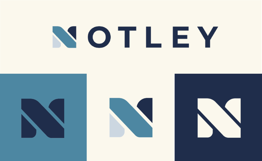
Notley Branding, 2019.
The Notley creative team turned a few keywords from our new messaging:
Agile… Bold… Relentless…
into hours of prototyping…
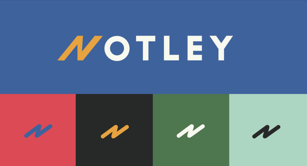
and brainstorming…
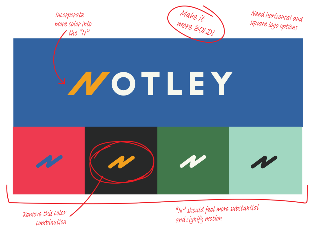
Until we reached a brand personality that is genuine, active and encouraging of swift activism.
Logo
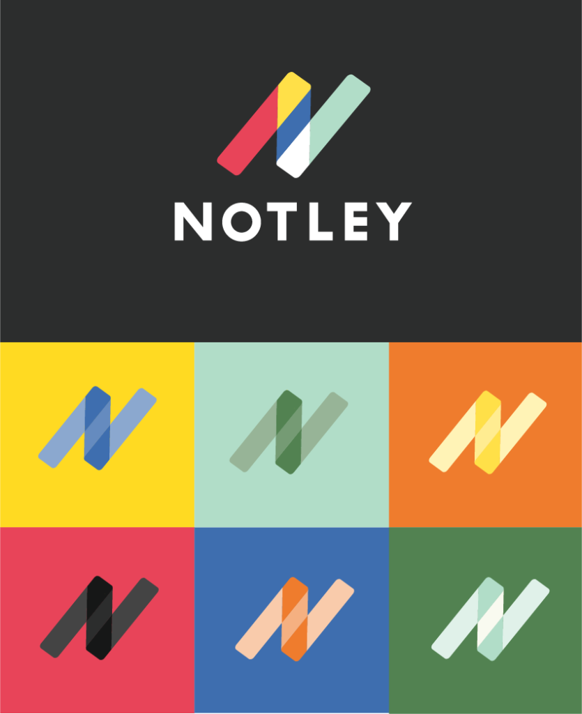
When re-evaluating the structure of the “N”, our leading design principle was flexibility. We tend to fit ourselves into tight spaces, wedge doors open for others, stay at-the-ready, and make room for new kinds of impact. Today, the “N” is more active and pointing up and out, seemingly in perpetuity.
Our new “N” is made up of five different colors and three intersecting parts organized in a deliberate up-and-to-the-right motion, illustrating the individual & collective contributions that coalesce as part of the Notley ecosystem to drive social impact.

Color
Our new logo captures our integrative nature and tendency to pull from industries and cause areas to make the strongest, most collaborative impact.
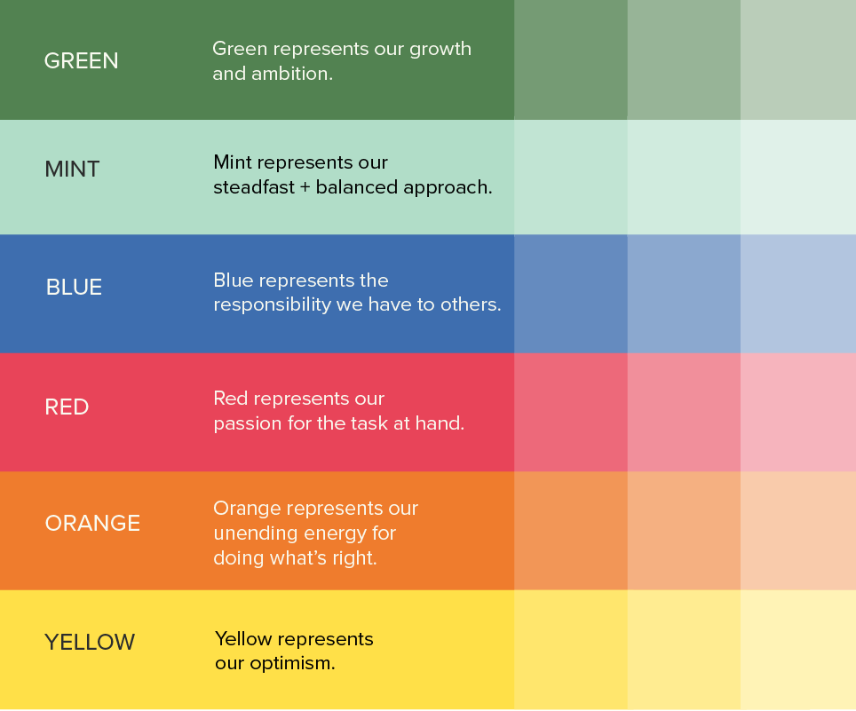
Exploding our color family from “tech blues” to a bold, versatile family helps us more easily carry our identity across many initiatives and programs in our network. We are a community of people with diverse perspectives – people who lean into laughing, listening, and a “no idea is too crazy” mentality.
Typeface
We then chose two highly accessible and legible typefaces – AVENIR and Proxima Nova. We use AVENIR in our logos and Proxima Nova as our primary across both headlines and body copy in multiple weights.
Ecosystem Updates
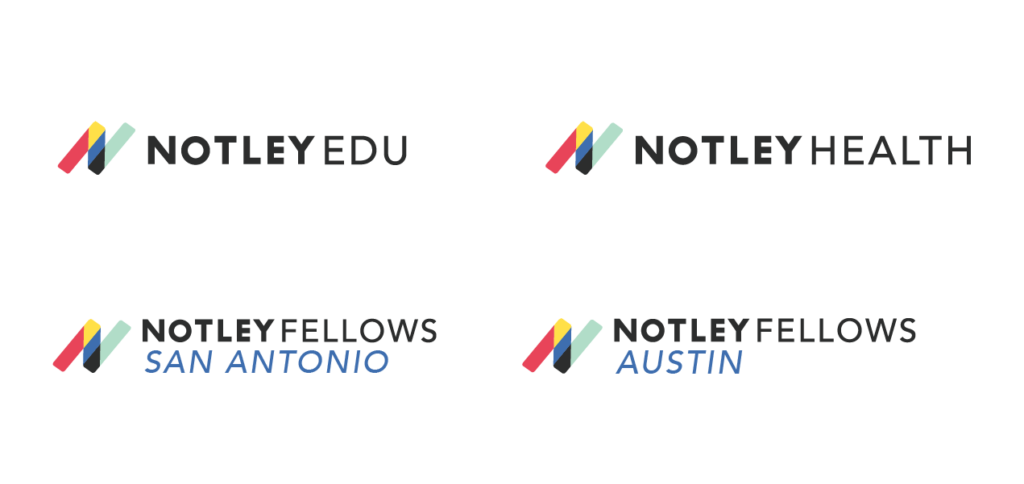
Notley-specific initiatives also received a major facelift, while all other initiatives maintain independent branding as they continue to do great work! Although we house, support, and integrate our work with many organizations across the nation – our new look highlights our ability to come together for the betterment of the social impact community at large.
Notley is an Austin-based band of relentless changemakers combating issues across multiple cause areas. Since 2015, Notley has provided the creative space and resources necessary to make the most impact in our communities. Through the use of magnetic risk capital, we work to bridge the gap of collaboration between for-profits and nonprofits to solve problems quicker.
Today, Notley challenges the status quo with new models never before thought possible in communities across the nation, including Austin, Columbus, Philadelphia, and San Antonio.
Together, we instigate outsized impacts. Learn more at www.notley.com.
